
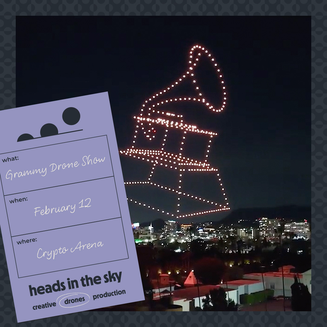
Heads in the Sky brought me on to build their brand identity from the ground up. Inspired by the agency’s LA roots and mid-century influence, we crafted a system of bold color, simple geometry, and playful motion to match the energy of their work.
Using the shapes from the logo, I created a playful animation for the brand launch. This piece lived across HITS’s social and site as an abstract introduction to the identity.
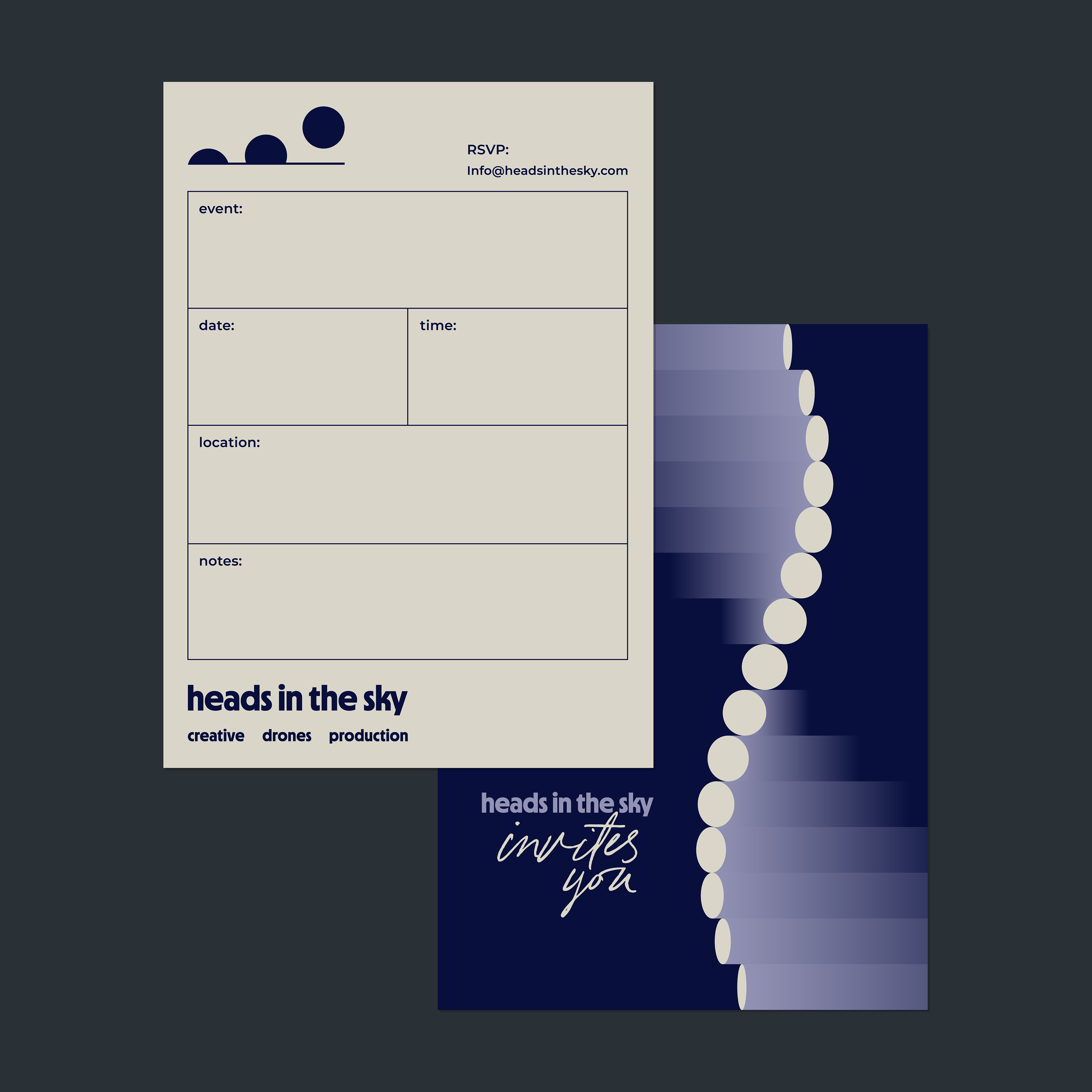
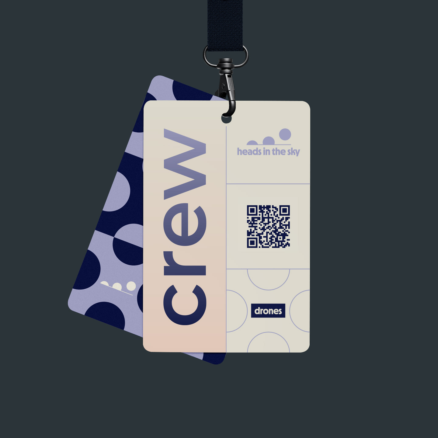
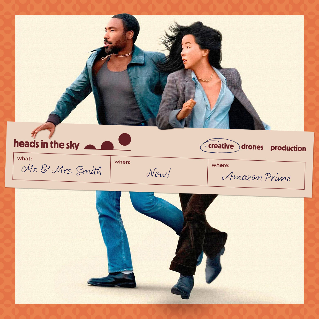
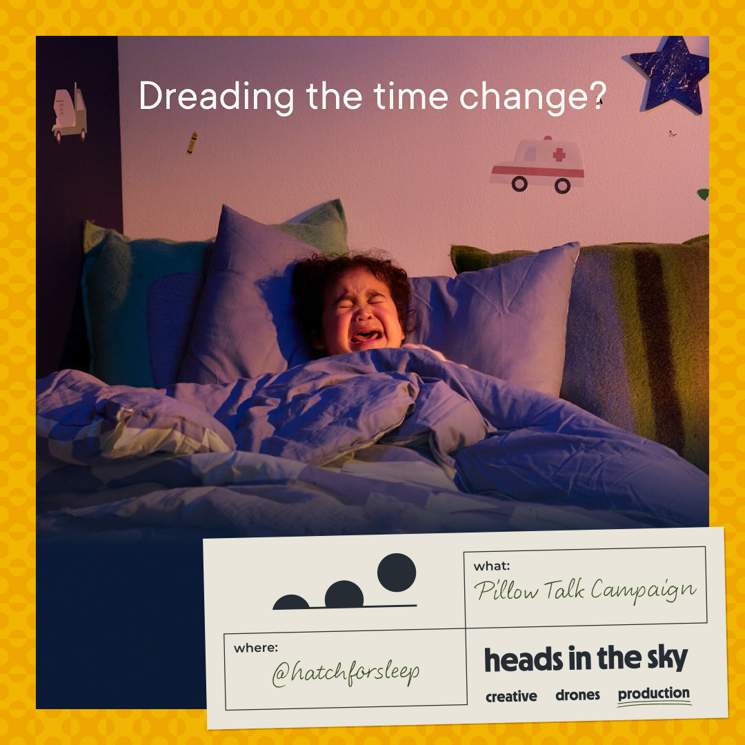
Subtle shifts in color and motion separate each of HITS’s divisions within the larger identity.

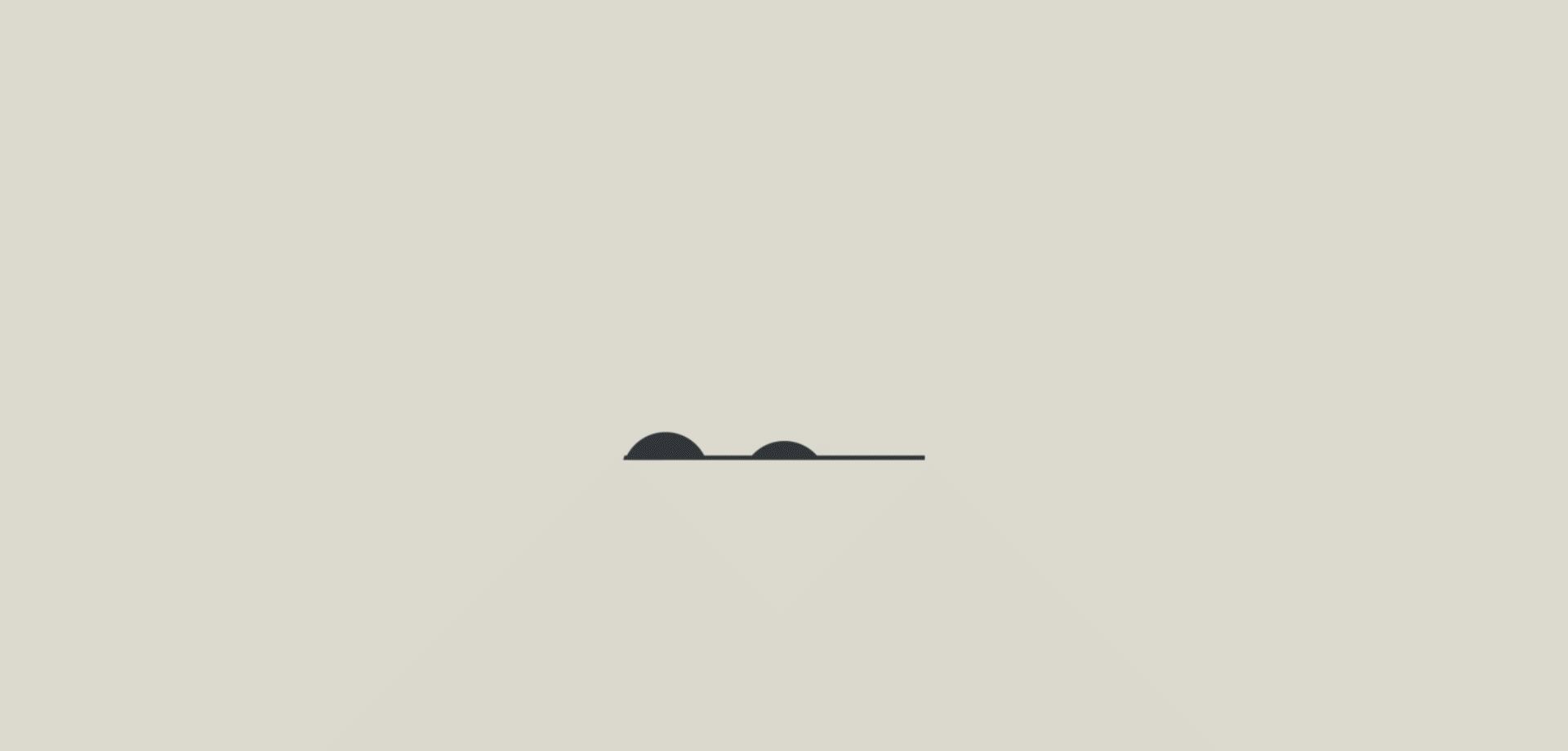
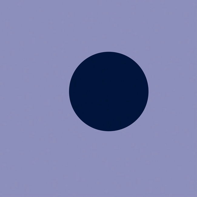
The logo’s circles became the foundation for a series of fast, energetic animations tied to each division.
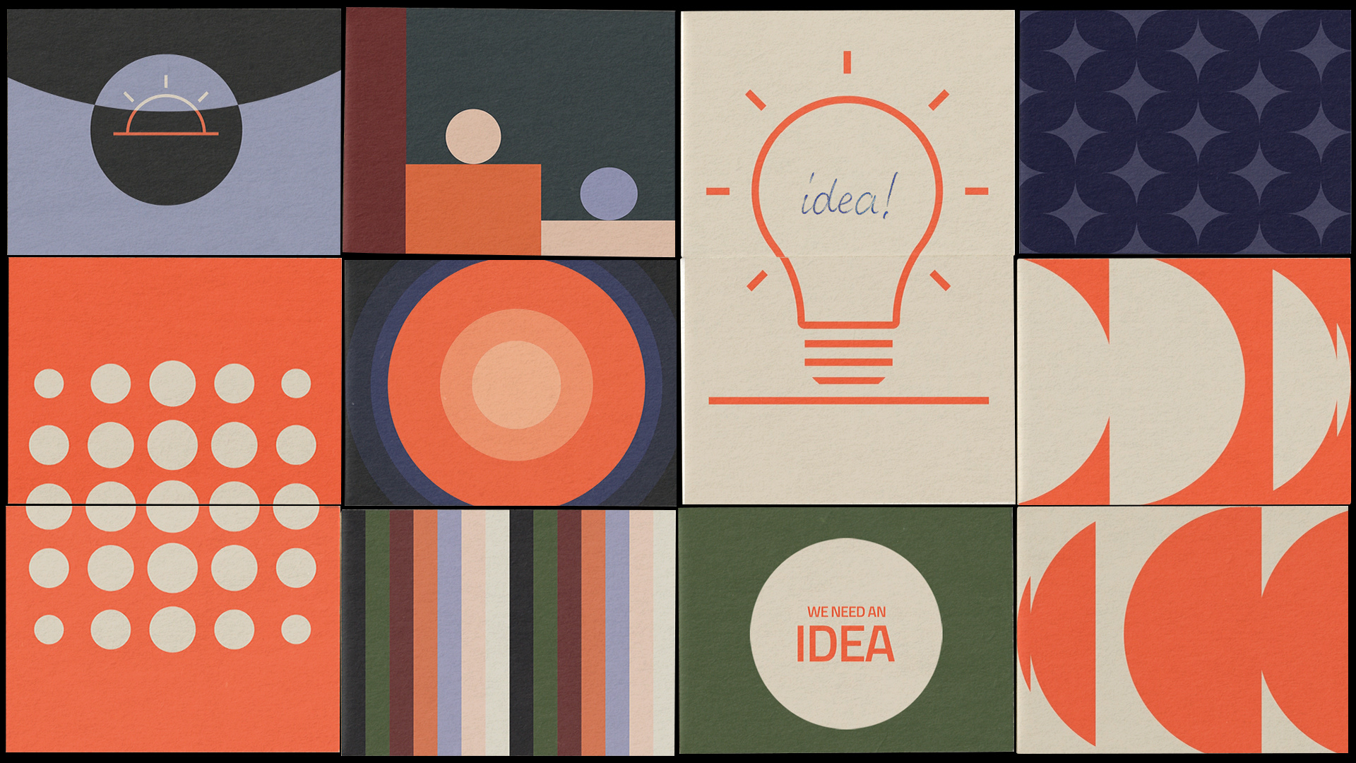
Early style frames created while developing the animation direction
A rose-inspired logo animation to promote HITS’s drone show for The Bachelor.